More than 90% of prescriptions filled in the U.S. are for generic drugs. Yet, many patients still hesitate to take them. Why? Because they don’t understand what generics really are. A pill that looks different, costs less, and has a different name feels suspicious-even when it’s just as safe and effective as the brand-name version. That’s where infographics about generics come in. They turn confusing science into clear pictures, helping patients make confident choices without jargon or fear.
Why Patients Doubt Generic Medications
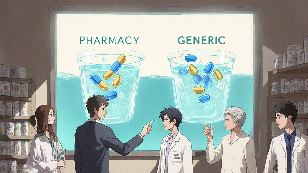
Patients often think generic drugs are cheaper because they’re lower quality. They notice the shape, color, or size is different. They worry about inactive ingredients. Some have heard stories-online or from friends-about generics not working as well. These fears aren’t irrational. They’re based on real experiences with confusing packaging, inconsistent pill appearances, and vague explanations from providers who don’t have time to explain. The truth? Generics must meet the same strict standards as brand-name drugs. The FDA requires them to have the same active ingredient, strength, dosage form, and route of administration. They must also be bioequivalent-meaning they work the same way in the body. But none of that comes across in a 30-second conversation at the pharmacy counter. That’s where visual tools make the difference. A well-designed infographic can show, not tell. It can compare dissolution rates side by side. It can illustrate how the same molecule works whether it’s made by Pfizer or a smaller manufacturer. It can break down the approval process into simple steps. And it can do all this in under two minutes.How FDA Infographics Build Trust
The U.S. Food and Drug Administration (FDA) leads the way in creating clear, evidence-based infographics about generics. Their most popular piece, What Makes a Generic the Same as a Brand-Name Drug?, uses visual graphs to show how generic and brand-name versions dissolve at nearly identical rates in lab tests. In patient testing, 89% of people understood bioequivalence after seeing this graphic-compared to only 67% who saw similar visuals from other sources. These aren’t just pretty pictures. Each infographic goes through patient comprehension testing with at least 30 diverse participants before release. They’re written at an 8th-grade reading level. Colors meet accessibility standards. Text includes alt descriptions for screen readers. And every graphic is available in Spanish as Medicamentos Genéricos. One key insight from FDA’s research: patients aren’t afraid of generics because they’re cheap. They’re afraid because they feel left out of the decision. Infographics give them control. They can read them at home, show them to family members, or bring them to their doctor’s appointment. That simple act of having a visual reference reduces anxiety and builds trust.What Makes a Good Generic Drug Infographic?
Not all visual tools are created equal. The best ones follow a few clear rules:- Focus on equivalence-not just similarity. Show that the active ingredient is identical, not just “similar.”
- Use side-by-side comparisons-like matching pill shapes or dissolution curves-to make differences obvious and reassuring.
- Explain inactive ingredients-many patients think fillers like lactose or dyes are dangerous. Clear labels show they’re harmless and regulated.
- Include cost savings-people respond to numbers. Showing that generics saved the U.S. healthcare system $1.68 trillion between 2010 and 2019 makes the value tangible.
- Address appearance changes-patients often refuse a refill because the pill looks different. A graphic that says, “This is the same medicine, just made by a different company,” cuts confusion in half.
Where These Tools Are Used-and How
You’ll find these infographics in places where patients need them most:- Pharmacies-printed and placed near the counter. Pharmacists at Kaiser Permanente report that using these visuals cuts counseling time for generic questions in half.
- Doctor’s offices-tucked into patient education folders or shown on tablets during visits. The American Medical Association rated FDA infographics a 4.7 out of 5 for helping doctors explain generic substitution.
- Online portals-Epic Systems added FDA infographics to its patient portal in late 2022. In six months, over 450,000 patients viewed them.
- Community clinics-in areas with high uninsured populations, these visuals help patients understand why their prescription changed from brand to generic without extra cost.
Where Current Tools Fall Short
Even the best infographics have gaps. One major issue: they rarely mention when generics might not be ideal. For drugs with a narrow therapeutic index-like warfarin, levothyroxine, or phenytoin-small differences in absorption can matter. The FDA’s infographics don’t visually flag these cases, even though they mention them in text. The Institute for Safe Medication Practices (ISMP) recommends adding a visual indicator-like a warning icon or color band-for these high-risk medications. Right now, that’s missing. Another blind spot: health equity. While the FDA’s Generic Drugs and Health Equity Handout is the only graphic that addresses how generics reduce access gaps for minority populations, most others don’t. Data shows African American and Hispanic patients are more likely to distrust generics than White patients. Yet few visuals speak directly to those concerns. And while the FDA’s materials are available in Spanish, many other organizations-like the GTMRx Institute-offer only a fraction of their resources in languages other than English. That limits reach.
The Future of Visual Medication Education
The next wave of these tools is interactive and immersive. In early 2023, the GTMRx Institute launched digital infographics where patients can input their medications and get a personalized complexity score. Early results show a 27% improvement in understanding compared to static versions. The FDA is testing augmented reality (AR) for 2024. Imagine pointing your phone at a pill bottle and seeing a 3D model of the active ingredient-then watching it dissolve in real time alongside the brand-name version. This isn’t science fiction. It’s already in prototype. These advances aren’t about flashy tech. They’re about meeting patients where they are. Younger patients won’t print a PDF. They’ll scan a QR code. Older patients might prefer a large, printed version with bold text. The goal is to offer both-and make sure neither feels like an afterthought.What You Can Do Today
You don’t need to wait for AR or interactive tools to make a difference. Here’s how to use what’s already available:- Download the FDA’s What Makes a Generic the Same as a Brand-Name Drug? infographic from their website. It’s free and ready to print.
- Keep a copy in your waiting room, on your phone, or taped to your fridge.
- Use it when you’re unsure about a generic refill. Show it to your pharmacist or doctor and ask: “Does this match what’s shown here?”
- Share it with someone who’s afraid to switch. Often, all they need is to see the science laid out simply.
Are generic drugs really as safe as brand-name drugs?
Yes. The FDA requires generic drugs to have the same active ingredient, strength, dosage form, and route of administration as the brand-name version. They must also be bioequivalent-meaning they work the same way in the body. Before approval, generics go through the same rigorous testing for purity, potency, and safety. The only differences are in inactive ingredients (like color or filler) and packaging, which don’t affect how the drug works.
Why do generic pills look different from brand-name ones?
By law, generic manufacturers can’t copy the exact appearance of brand-name drugs, including color, shape, or markings. This is to avoid confusion and protect trademarks. But these visual differences don’t affect how the medicine works. The active ingredient-the part that treats your condition-is identical. Infographics show side-by-side comparisons to prove this, helping patients recognize that different looks = same medicine.
Can I trust generics if they cost so much less?
Absolutely. Generics are cheaper because manufacturers don’t need to repeat expensive clinical trials or pay for brand marketing. The FDA still requires them to meet the same quality standards. In fact, many generic drugs are made in the same factories as brand-name versions. The cost difference comes from competition, not lower quality. Over the past decade, generics saved the U.S. healthcare system over $1.68 trillion.
Do infographics work for older adults or people with low health literacy?
Yes-when designed well. The FDA’s infographics are tested with real patients, including older adults and those with limited reading skills. They use high-contrast colors, large fonts, simple language (8th-grade level), and clear visuals. Studies show 87% of participants understood key concepts after viewing them. Printed copies placed in waiting rooms or handed out by pharmacists are especially effective for this group.
Are there any drugs where generics might not be the best choice?
For most drugs, generics are just as effective. But for medications with a narrow therapeutic index-like warfarin, levothyroxine, or phenytoin-small differences in absorption can matter. While generics are still approved as safe, some patients and providers prefer to stick with one brand to avoid any variation. These cases are rare, but important. Current infographics mention this in text, but don’t yet use visual warnings. Always talk to your pharmacist or doctor if you’re unsure.
Where can I find reliable generic drug infographics?
The best source is the U.S. Food and Drug Administration (FDA). Their website offers free, downloadable PDFs like "Facts About Generic Drugs," "What Makes a Generic the Same as a Brand-Name Drug?" and "Generic Drugs and Health Equity Handout." These are peer-reviewed, tested with patients, and available in Spanish. Other trusted sources include the GTMRx Institute and BeMedWise, but the FDA’s materials are the most comprehensive and widely used in clinical settings.


gerardo beaudoin
November 30, 2025 AT 18:55Had a pharmacist hand me one of these infographics last month after I asked why my blood pressure med looked different. Didn’t even need to say anything-he just pointed to the dissolution chart. I was sold. Simple, clear, no jargon. Why isn’t this standard everywhere?
Joy Aniekwe
December 1, 2025 AT 04:27Oh wow, so now we’re romanticizing government infographics like they’re art installations? Next they’ll put a QR code on my insulin that plays a lullaby about bioequivalence. Meanwhile, my cousin’s aunt’s neighbor still got sick because the generic ‘worked the same’-except it didn’t. And now we’re supposed to trust a PDF?
Latika Gupta
December 3, 2025 AT 03:41I read this and thought about my mother in Delhi. She refused her generic thyroid pill for two years because the tablet was yellow instead of white. She said it felt ‘wrong.’ I printed the FDA infographic, translated it into Hindi using Google Translate, and showed it to her. She cried. Not because she was scared-but because she finally felt seen. I wish someone had done this for her sooner.
Sullivan Lauer
December 3, 2025 AT 21:14Let me tell you, this isn’t just about pills and colors-it’s about dignity. Think about it. You’re sitting in a clinic, tired, maybe sick, and the doctor says, ‘Here, take this cheaper version.’ No explanation. No visuals. Just a pill that looks like it came from a cartoon villain’s lab. Then you get home, you Google it, and suddenly you’re reading Reddit threads about ‘generic scams.’ That’s not patient education-that’s abandonment. But when you hand someone a graphic that shows side-by-side dissolution curves like twin engines running the same fuel? That’s respect. That’s empowerment. That’s healthcare that doesn’t talk down to you. And yeah, I’ve seen it work. My uncle took warfarin for ten years on brand, switched to generic after seeing the FDA graphic, and now he’s hiking in Colorado at 78. He didn’t need a lecture. He needed a picture.
Brandy Johnson
December 4, 2025 AT 20:43The FDA’s approach is a textbook example of bureaucratic paternalism disguised as public service. These infographics assume patients are incapable of understanding basic pharmacology, yet simultaneously expect them to trust an agency that has approved drugs with lethal side effects. The real issue isn’t lack of visuals-it’s lack of accountability. If generics are truly equivalent, why are there no mandatory post-market surveillance dashboards publicly displayed alongside these charts? This is performative transparency.
Peter Axelberg
December 6, 2025 AT 08:06There’s a moment in every pharmacy when the pharmacist hands you a pill that looks nothing like the one you’ve been taking for years. And you freeze. That’s not fear of cost-that’s fear of being lied to. The FDA’s infographics work because they don’t try to convince you. They show you. Side-by-side. Same molecule. Same effect. Different wrapper. That’s it. No hype. No spin. Just facts. And you know what? People get it. I’ve handed these out in my community center. Grandmas, teens, veterans-they all stop. They look. They nod. And then they say, ‘Oh. So it’s just the paint.’ That’s the power of clarity. We don’t need AR. We need to stop talking over people and start showing them.
Monica Lindsey
December 6, 2025 AT 19:58Infographics are a Band-Aid on a bullet wound. If patients don’t trust the system, a pretty chart won’t fix that. And let’s be honest-most of these visuals are written for people who already want to believe. The ones who need them most? The ones who’ve been burned? They’re too busy being angry to read a PDF.
jamie sigler
December 8, 2025 AT 18:26So we’re just gonna ignore the fact that some people have real bad experiences with generics? Like, yeah, the science says it’s fine-but I’ve seen people get dizzy, nauseous, even have seizures after switching. And now you want me to believe a color-coded chart is the answer? That’s not education. That’s gaslighting.
Bernie Terrien
December 9, 2025 AT 18:09These infographics are the only thing keeping the American healthcare system from collapsing under its own incompetence. They’re the silent heroes in the pharmacy aisle-quietly dismantling decades of pharmaceutical fear-mongering with a single side-by-side graph. No fanfare. No lobbyists. Just truth, in Helvetica, with accessible contrast. The FDA might be broken, but this? This is their one clean win.